


$14.00
DATA VISUALIZATION WITH EXCEL CHARTS & GRAPHS from Chris Dutton
You will receive this product within 24 – 48 hours after payment
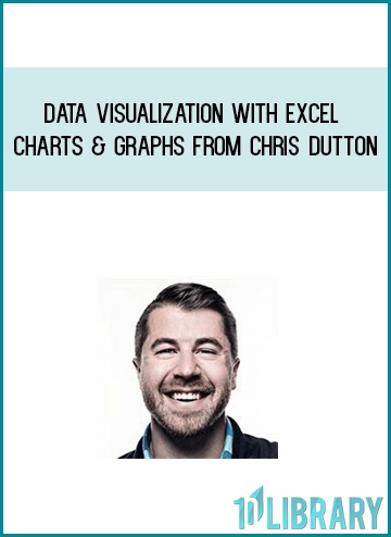
DATA VISUALIZATION WITH EXCEL CHARTS & GRAPHS from Chris Dutton
Course Preview:
ABOUT THIS COURSE
Ask people what comes to mind when they think of Excel, and odds are they’ll say “spreadsheets”. The truth is, Excel is an incredibly powerful, robust, and dynamic data visualization platform for those willing to think beyond rows, columns, and primitive pie charts — and I’m here to prove it.
This course gives you a deep, 100% comprehensive understanding of Excel’s latest data visualization tools and techniques. I’ll show you when, why, and how to use each chart type, introduce key data visualization best practices, and guide you through interactive, hands-on demos and exercises every step of the way.
WHAT WILL YOU LEARN?
We’ll kick things off by exploring each of the 20+ chart types that Excel 2016 has to offer, including:
Bar & Column charts
Histograms & Pareto charts
Line charts & trend lines
Area charts
Pies & Donuts
Scatter plots & Bubble charts
Box & Whisker charts
Tree Maps & Sunbursts
Waterfall & Funnel charts
Radar & Stock charts
Heat maps, 3-D Surface & contour charts
Chloropleths & Geospatial maps
Custom combo charts & graphs
Sparklines
And more…From there we’ll dive into a series of 12+ advanced Excel demos guaranteed to turn you into an absolute data viz rockstar. These aren’t “textbook” demos that you can find on YouTube; these are projects adapted from actual, award-winning work featured by Microsoft, MIT, and the New York Times. I’ve built my analytics career around data visualization, and I can help you do the same.
Whether you’re looking for a quick primer, trying to diversify your Excel skill set, or hoping to step up your data visualization game in a major way, this course is for you. In fact, if you don’t learn something brand new in this course, I will make sure you get your money back AND give you a virtual high-five for checking it out!
Regular Price
$175
Today’s Price
Only $29
Savings
Over 85% OFF
“Absolutely great stuff. I really enjoyed it! Chris is truly a Excel guru. I strongly recommend this course to all Excel users looking to improve their skills.”
– Nirav M.
“Excellent from start to finish, picked up a bunch of things that will be useful in the workplace with entry level to ramping it up to some very cool advanced visualizations. Loved all of it, hope I can learn more in the future from this wonderful individual!”
– Robert C.
“At the first part I just said to myself, “Wow, Excel is capable of that? It’s amazing!” Then at the second part I told myself “This guy is doing magic!”, and now I feel like I’m capable of doing the same. I’m definitely buying his other courses!”
– Judit B.
WHAT’S INCLUDED IN THE COURSE?
LIFETIME access to all content
Downloadable project files and resources
Unique, hands-on demos and case studies
Course quizzes & homework exercises
Certificate of Completion
100% MONEY-BACK GUARANTEE
who IS THIS COURSE FOR?
Anyone looking to create beautiful, custom data visualizations in Excel
Excel users who have basic skills but want to master advanced charts, graphs & dashboards
Students looking for an engaging, hands-on, and highly interactive approach to training
Meet Your Instructor
Chris Dutton
Chris Dutton
Chris Dutton is a certified Excel expert, EdTech entrepreneur, and best-selling instructor with 10+ years specializing in data visualization and business intelligence.
As Founder and COO of Maven Analytics, Chris’ work has been featured by Microsoft, HuffPost, Entrepreneur.com and the New York Times, reaching more than 500,000 students around the world. A leader in analytics education, Maven Analytics seeks to empower everyday people to change the world with data. Chris graduated summa cum laude and received the Charles Bluhdorn Prize in Economics at Tufts University.
Course Curriculum
Getting Started
Course Structure & Outline (1:27)
DOWNLOAD: Course Resources
Setting Expectations (2:02)
Data Visualization Best Practices
Key Principles & The 10-Second Rule (2:45)
The Good, The Bad & The Ugly (3:44)
Three Key Questions (1:49)
Chart Formatting & Customization
Chart Elements, Layouts & Styles (6:20)
Chart Formatting Options (5:26)
Changing Chart Types & Adding a Secondary Axis (3:03)
Creating, Modifying & Applying Custom Templates (4:06)
QUIZ: Chart Customization
Mastering Basic Charts & Graphs
Bar & Column Charts (8:49)
HOMEWORK: Bar & Column Charts
Histogram & Pareto Charts (5:58)
HOMEWORK: Histogram & Pareto Charts
Line Charts & Trendlines (5:16)
HOMEWORK: Line Charts & Trendlines
Area Charts (4:41)
HOMEWORK: Area Charts
Pies, Donuts & Race Tracks (12:04)
HOMEWORK: Pies, Donuts & Race Tracks
Scatter Plots (7:30)
Bubble Charts (6:36)
HOMEWORK: Scatter Plots & Bubble Charts
Box & Whisker Charts (6:05)
HOMEWORK: Box & Whisker Charts
Tree Maps & Sunbursts (6:36)
HOMEWORK: Tree Maps & Sunbursts
Waterfall Charts (3:17)
Funnel Charts (3:42)
HOMEWORK: Waterfall & Funnel Charts
Radar Charts (7:56)
HOMEWORK: Radar Charts
Stock Charts (7:18)
HOMEWORK: Stock Charts
Heat Maps (4:41)
HOMEWORK: Heat Maps
Surface & Contour Charts (7:35)
HOMEWORK: Surface & Contour Charts
Geospatial Maps with Power Map (5:28)
HOMEWORK: Power Map
Basic Combo Charts (7:57)
HOMEWORK: Combo Charts
Sparklines (2:07)
HOMEWORK: Sparklines
QUIZ: Basic Charts & Graphs
Next-Level Data Viz Demos
Setting Expectations (1:40)
DEMO: Custom Image Overlay Charts (6:01)
DEMO: Adding Binary Values to Highlight Ranges (5:02)
DEMO: Automation with OFFSET & COUNTA (7:08)
DEMO: Adding Interactive Elements with Form Controls (12:30)
DEMO: Animating Changes Over Time (14:20)
DEMO: Building a Dynamic Dashboard (Part 1) (16:10)
DEMO: Building a Dynamic Dashboard (Part 2) (12:08)
DEMO: Dynamic Value-Based Formatting (10:09)
DEMO: Dynamically Highlighting a Data Series (10:26)
DEMO: Building a Custom Pacing Chart (10:22)
DEMO: Building a Custom Gauge Chart (9:58)
DEMO: Visualizing Percentages with Arrays (7:16)
QUIZ: Next-Level Data Viz
Wrapping Up
More from Maven Analytics
Frequently Asked Questions
When does the course start and finish?
The course starts now and never ends! It is a completely self-paced online course – you decide when you start and when you finish.
How long do I have access to the course?
How does lifetime access sound? After enrolling, you have unlimited access to this course for as long as you like – across any and all devices you own.
What if I am unhappy with the course?
We would never want you to be unhappy! If you are unsatisfied with your purchase, contact us in the first 30 days and we will give you a full refund.
Are there any prerequisites for this course?
• Microsoft Excel installed and ready to roll (compatible with Excel 2007, Excel 2010, Excel 2013, or Excel 2016)
• Some experience with basic formulas is recommended, but not required (we’ll spend some time laying the groundwork for the more advanced stuff)
Get immediately download DATA VISUALIZATION WITH EXCEL CHARTS & GRAPHS from Chris Dutton
Be the first to review “DATA VISUALIZATION WITH EXCEL CHARTS & GRAPHS from Chris Dutton”
You must be logged in to post a review.
The Course is digital products included PDFs,Videos (MP4,TS,AVI files), Audio (MP3,M4A), Document (Word, Exel,Power Point..)
We will provide the download link accordingly with the Email address on your “Order Reciep”.
Skype : [email protected]
Related products
Everything Else
Everything Else
Everything Else
Everything Else

Forex & Trading

Everything Else
Everything Else
Graham Jamieson – Hypnosis and Conscious States The Cognitive Neuroscience Perspective
Reviews
There are no reviews yet.